Color Talk – Jonathan Rikner’s Sculpted Amber
Posted on December 2, 2025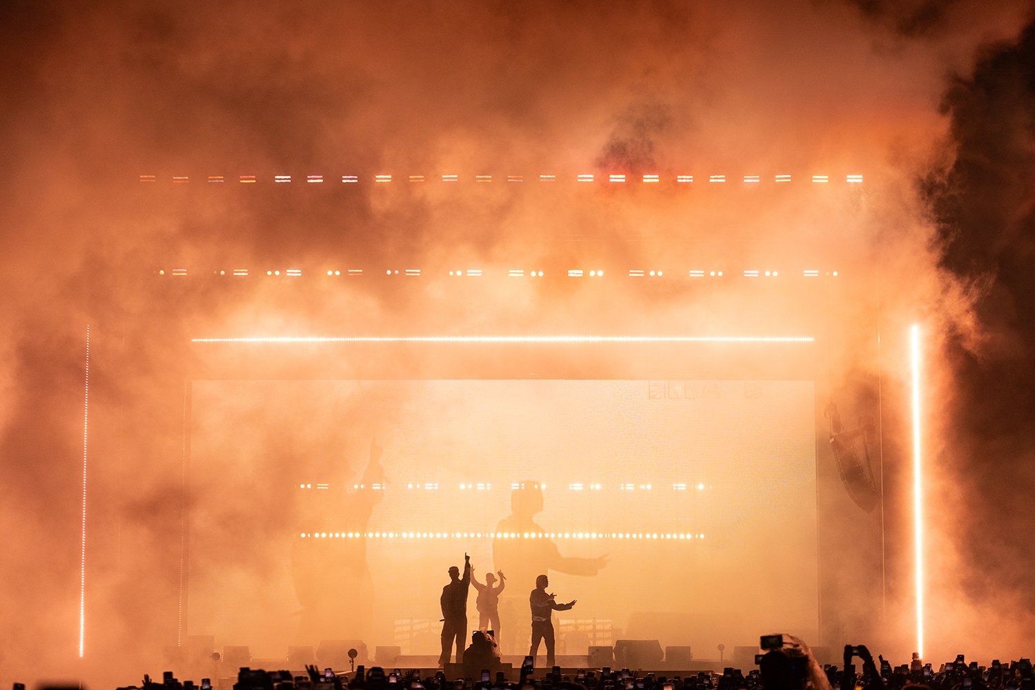
This talented young Swedish designer created some potent looks for legendary Hip Hop band Hov1 on their final global tour not long ago. There were many evocative moments in his show, but one that exerted a particularly tight grip on our attention was the look captured in this photo that shows live camera feeds of his clients in a sea of smoky haze and amber, perhaps the most “earthy” of all colors.
Sculpting his amber wash with white light in various shades and brightness levels, Rikner endowed this already deep color with new levels of depth. Calming, thoughtful, and effusing positive vibes as it invariably does, amber provided Rikner with the ideal backdrop for the stirring lyricism of his client’s music in a song that deals with love, loss, and the optimism to move on.
You worked smoke and amber together very effectively. Why amber? Would smoke have had a different kind of effect if you worked it with other colors?
“Amber has this magical ability to feel like sunlight — warm, fuzzy, and just plain happy. It’s not a color that screams at you — it sort of hugs you. I wanted the crowd to feel that warmth not just visually, but emotionally, like their minds were being wrapped in light. When you combine it with haze, it’s like the whole atmosphere starts glowing, almost as if the air itself is alive. If I’d used magenta or green with the haze, the effect would have been completely different — colder, more distant, maybe even eerie. With amber, it became inviting, like a visual smile that reached all the way to the back.
Would you have done a different type of design if the dominant color were red or blue?
Well, here’s the thing — we actually based the entire show on a really narrow palette. I only used Amber, Blue, Red, Cyan, CTB, and CTO. That was an artistic choice. No harsh neon greens or pinks this time, because I wanted the whole show to feel alive and natural. Red and blue absolutely bring different energies: red is raw intensity, like it’s pounding a fist on the table, while blue is reflective, almost melancholy. And instead of going wild with every possible color, I leaned into the psychology of the palette. The cool tones played on the subconscious — pulling the audience into more emotional moments — while the warm tones delivered energy and optimism. It wasn’t about showing off every color in the box, it was about building trust with the audience through consistency, then surprising them with how those “limited” colors could still tell a huge story.
The smoke had the effect of making the color tone asymmetrical so it was darker stage left than it was stage right. Why did you do that?
“Honestly? That was the open air helping me out. The winds in the area pushed the haze unevenly at times, and suddenly, one side of the stage looked heavier and darker. It wasn’t something I planned, but when I saw it happen, I thought, “This actually looks great — let’s keep it.” I had almost 30 well-distributed smoke machines around the area to mitigate this, so most of the time it was very even. But sometimes the so-called mistakes become the best design choices. It gave the whole stage picture this sense of movement, like the light itself was drifting. I like it when the environment pushes back a little. It keeps you on your toes and reminds you that you’re painting with air, not just with fixtures.
Speaking of horizontal, you also had your vertical bars brighter and thicker on the right than you did on the left. Why was that?
That was partly the haze again — it was cutting the output on the left side more, so the right side naturally read as bolder. But honestly, I don’t mind that imbalance at all. In fact, I like it. Perfect symmetry can look too safe. By letting one side feel “heavier,” the whole image has more tension. Plus, our eyes scan left to right, so the weight on the right side actually made the stage feel like it was opening up. Sometimes the most interesting looks come from leaning into what the haze wants to do, rather than fighting it.
Can you tell us a bit about why you had the two shadowy figures on the backdrop? What were they? Projections?
That was actually the live camera feed. About 90% of the show visuals were real-time camera work — not just the IMAGs, but also feeding directly into the backdrop. So those ghostly figures were the band themselves, caught live and layered into the show. And here’s the funny part: all the cameras were old analog ones. I’m talking proper retro. We had to run them through this Frankenstein’s chain of converters: composite to S-video to SCART to HDMI to wireless link to SDI. By the time the signal got to us, it had traveled more formats than most touring bands! And still, with all that, the latency was lower than some modern digital products. So yeah, a little old-school charm goes a long way.
What color number amber did you use? What was the color temperature of your white light?
I’m not really a “gel number” guy. I trust my eye more than charts. For me, it’s about what makes the fixture sing in the moment. But we did set some references for the follow spots: 4200K on the front, 5000K on the back, while recording everything in 5600K. That way, the video capture came out feeling warm and personal without losing clarity. It’s like a filter that makes people look a little more human, a little less sterile. And on stage, that warmth read beautifully against the sharper whites and cooler tones.
What did your color combination reflect about the song on stage?
I designed each song by asking myself: “What did I feel the first time I heard this song?” That feeling was my compass. Each track had its own emotional fingerprint — but I also tried to weave them together so the whole show felt like one story. For this particular song, which is about saying goodbye but also about growing stronger, I started in hard orange — carrying that punch of anger and frustration. Then I slowly opened the palette up, adding light and space, creating an atmosphere of hope and energy for the future. It was less about lighting the stage and more about lighting the emotion.