Color Talk – Pierre E. Roy’s Purple Play
Posted on November 4, 2025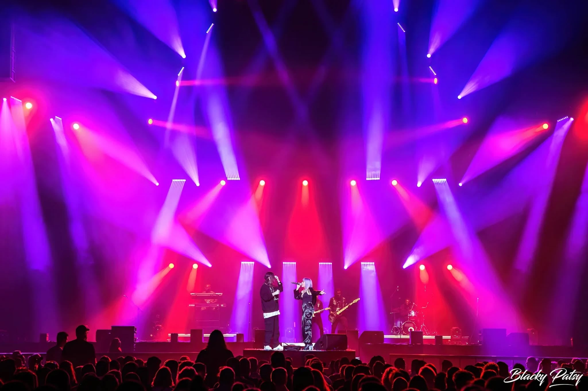
Pierre E. Roy of Agence de spectacles Pierre Roy says that he has “great respect for science,” but when it comes to design and art, he believes that feelings carry far more weight than so-called hard scientific evidence. Take the color purple, science says it does not really exist, but is made up by the human brain to balance two color extremes … Roy begs to differ.
In his world of lighting design, purple is very, very real, possessing the power to elicit a wide range of feelings. Its impact on our emotions is often shaded by the colors that interact with it. Roy demonstrated this in stunning fashion when lighting La Légende by comedian Dave Gaudet at the Place Bell in Quebec, as he married purple and red on stage.
The magic of that moment is captured in this photo. We were so struck by the image that we had to talk to Roy about this extraordinary color union.
Red is a warm color, while purple is typically considered to be cool. How did you balance them so harmoniously?
“It’s funny, because to me, purple is like a chameleon. It’s born from red and blue, so it carries both energies — warmth and coolness. That’s what fascinates me. Purple is my wildcard. It can heat up or soften, depending on what it’s paired with. When I combine it with red, I avoid visual overload. Purple cuts through the intensity and wraps it in something gentler. It tempers the emotion without diluting the power. That’s where the balance lies.”
As you just mentioned, you have the two colors overlap one another in your design rather than keep them in their own separate lanes. Why is that?
“I’m always looking for a sweet spot between impact and softness. When colors blend into each other, they tell a more fluid, organic story. If you separate them too sharply, the eye stops — I want it to glide, to wander. Overlapping creates a visual tension that’s controlled, almost like a gentle movement. It’s how I keep the image striking, but never aggressive. Because at heart, I’m a soft soul who likes things that breathe, ha ha!”
Did you start this design with red or purple? If you started with red, did you consider anything other than purple as the second color?
“I always start with the ‘lead role’ — in this case, red. Then I choose a “supporting actor” that will make it shine. Purple just made sense. I often follow a simple rule: two colors, 70/30 ratio. With three, it’s 60/30/10. It’s a principle I learned from a painter friend of mine (Pierre Dufour) — in a past life, as I like to say (lol). Even when I stay within one color family, I apply that rule using two shades. It’s like composing a song: you need a strong chorus, harmony, and a touch of surprise.”
You balance these two bold colors with a lot of black space. Why is that?
“Black is like the space between musical notes. It lets everything breathe. Just as the placement of lights matters, so does the space between colors. That negative space gives structure and depth. Too much color, and you lose the story. Too much red, and it’s suffocating. Black is the exhale — the pause that allows the boldness to exist.”
In your mind, what do the two colors mean in your design?
“Red is the masculine force — love, power, life… but also death, conflict, and fire. It’s a color that screams. Purple, to me, is the feminine energy — calm, wisdom, connection. It holds things together. It reflects. It gathers. Put them together, and you get the dance between chaos and peace, between passion and reflection.”
Which shades (or color numbers) of red and purple did you use?
“I don’t use any technical references or codes. I build all my colors by feel. Nothing scientific — just instinct and inspiration. It’s like cooking without a recipe: if it feels right, it is right.”
Scientists now tell us that purple doesn’t really exist but is made up by our brains to balance two color extremes. Do you think purple has some mystical, imaginary quality to it?
“I have great respect for scientists… but in art, what matters is what it *feels* like.
And purple *feels* real — deeply real. Maybe that illusion is what makes it magical. It’s the ghost of a color, born from a compromise between two extremes. It’s spiritual, mysterious.
“I remember an album launch I lit at the Spectrum of Montreal about 20 years ago. The venue was originally drenched in heavy orange — super intense. I asked to change all the gels to lite blue. By the end of the night, every technician told me the same thing: “That’s the calmest we’ve ever felt during an event.”
Color absolutely affects our emotions. Even science is starting to catch up with what artists have always known.”