Color Talk – Crt Birsa’s Blues and Whites
Posted on June 2, 2025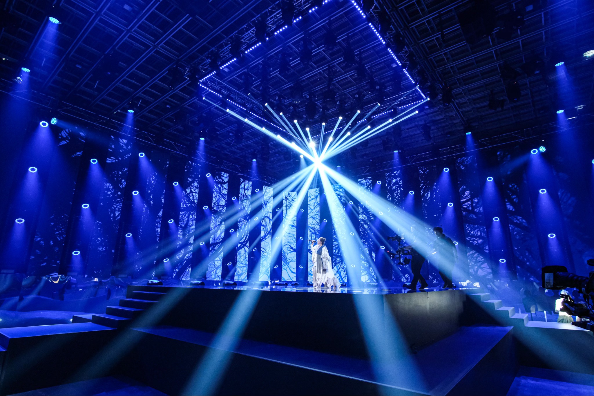
If you were an astronaut looking back on planet earth from your spacecraft, the mystical, glorious, and humbling image that held you in awe would be dominated by two colors: the foundational blue of the seas that cover over 70-percent of earth, and the delicate white of the clouds that drift over those waters.
There is a magical, primordial energy in the balance between blue and white; one that, as we’ve learned from space travel, defines the very contours of our world. Crt Birsa, the well-known Slovenian designer evoked the power of this timeless dance when lighting EMA 2025, the Slovenian national Eurovision pre-selection event, which is held at Studio 1 of Slovenian National Television in Ljubljana.
Like the astronaut’s view of earth, the scene created in this photo has blue as its foundation. But the white that glows at its core is not like the ephemeral clouds seen from space. It is so bright and alluring that it was hard for us to determine which color took the lead in his design as we stared at this image – and stare at it we did, captivated by the imagery.
This led us to contact Birsa, a partner in Blackout Designs to talk about the scene in this stunning photo. Here is what he had to say.
You really balance blue and white in this scene. It’s difficult to say which color is dominant. How would you describe the relationship between the two? What do the two colors do for one another?
“I think that the blue and white are quite a classic combination. In this particular case the white is connected to the performer’s dress and the blue to the feeling of the song and the singer’s snake eye yellow contact lenses, which are most present on camera with the blue fill of the light. Both are cold colors so the situation is almost monochrome with a slight brighter accent to expose the singer.”
The beams coming down from above the stage become more blue as they descend. How did you do that and why did you do that?
“This is pure physics. White beams are losing intensity over distance and because everywhere else is blue, they look blueish where the light beam becomes less concentrated. The other reason is where the white beam is tighter, it is also a bit overexposed, but because it is really narrow, the look doesn’t feel that the beams are overexposed in the center.”
In the center of the stage, where the singer is, it is almost all white. Then as you go out from there it becomes darker blue. Why did you do that?
“A lot of white feel comes from the brightness of the LED screen. There are two reasons for this. One is that the main camera shot direction is in this direction so we wanted a bright center, and then everything to fade a bit towards the sides. Second is that we wanted to emphasize the artist and have her present within so many lights in such a small space.”
The center of the backdrop is also white. Then it becomes darker blue and even black as you go to the edges with the images of the trees. What role does this play in your design?
“This is the same reason. This is a product of a close collaboration with the LED content design.”
What color temperature of white did you use? What shades of blue?
“We have used about 5000 K for the key lights so this is the other reason that the beams look a bit blueish on the camera as their output color temperature is more than 6000 K. For the blue it is impossible to say. I have mixed the blue color that looked good on camera and with the video content.”
In general terms how does this color scheme reflect this moment in time?
“This is a hard one. Let’s say it’s a beam of hope in the end of the dark tunnel.”