Pierre Claude – Lighting With Less
Posted on July 1, 2025
During the course of interviewing preeminent lighting designers for this column, we often inquire about their favorite colors. Their responses cover a rainbow of hues. But when we posed the question to this award winning French designer, he gave a delightfully surprising answer — “white!”
Often not even regarded as a color (it is, after all achromatic, having no chroma), white is typically taken for granted, a backdrop to the “real” action. But its low profile is a bit deceiving, given that all visible light wavelengths are reflected in white.
In this respect, white serves as the perfect metaphor for Claude’s minimalistic approach to lighting design. Shorn of all unnecessary frills and accompaniments, his designs might seem rather simple at first — that is until you actually see them and experience their power to move emotions.
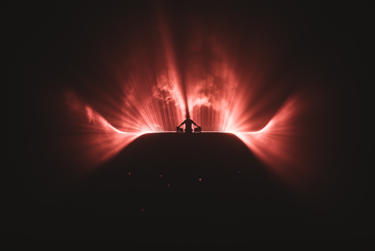
His minimalistic designs’ artfully inspired use of darkness, shadows, silhouettes, blinders and light angles endows the stage with a strong, evocative aura. Wielded with great subtlety his designs create surprises at every turn. At one moment, he might he might caress the performer on stage with soft silhouettes, only the have that artist engulfed in bright backlight the next moment, before floating on a sea of uplighting after that.
Claude demonstrated the magic of minimalism in his client Gesaffelstein’s iconic Requiem Tour, for which he won a LDI 2020 Design Achievement Award, as well as on tours for the legendary Etienne de Crécy, The Strokes, Phoenix, Air, and the ARTE Concert Festival in Paris. In every show, he is able to transform stages in ways that profoundly move audiences, not with massive rigs, but through the exquisite balance of light and set pieces, which play an increasingly important role in his designs.
Speaking to us from his Paris studio, Claude shared insights into getting more from less in lighting. This interview is perhaps a bit shorter than some of the other profiles we have run in the past. Indeed, it may be the only feature we’ve ever published that doesn’t have a single multi-paragraph answer… but such is the power of minimalism!
You are a big proponent of minimalism and your work incorporates this concept quite beautifully. In this day and age when there so many massive designs with blow-through video walls working with a large number of fixtures, how do you see minimalism fitting in?
“I think minimalism is more relevant now than ever. With the increasing complexity and cost of productions, a minimalist approach can be a breath of fresh air. It’s not just about stripping things down, but about focusing on what’s truly essential to the story or message. By using fewer elements, you can create a more intimate and immersive experience for the audience. Plus, it’s often more sustainable and cost-effective.”
Of course, as you suggest, minimalism does not necessarily mean scaled down or subdued, as you demonstrated in your award-winning work for Gesaffelstein’s Requiem Tour, where you had some thrilling strobing effects. Is it more challenging to generate this kind of excitement with a minimalistic design?
“Not necessarily. I think minimalism is about using the right tools for the job. In the case of the Requiem tour, the strobe effects were essential to creating the atmosphere and energy that Gesaffelstein wanted to convey. The challenge is knowing when to use restraint and when to let creativity explode. With a minimalist design, you have to be intentional with every element you include, but that doesn’t mean you can’t create intense or exciting moments. In fact, simplicity can sometimes amplify the impact of those moments. It’s complex to create a show without color and movement, relying solely on dynamics, but that’s what can make a minimalist design so powerful and evocative.”
Does a show with a minimalistic design require anything different from the audience?
“Yes, I think so. A show with a minimalist design often requires a more active participation from the audience. Since the visual and stage elements are stripped down to the essentials, the audience’s attention is focused on the key elements of the performance, such as the music, the artists’ movements, or the lyrics. This can create a more intimate and direct connection between the audience and the performance. The audience needs to be willing to immerse themselves in the experience and fill in the gaps with their imagination, which can make the show even more personal and memorable.”
Do you have to evaluate fixtures (projectors) differently when you create a minimalistic design, as opposed to a busier design?
“Yes, absolutely. When creating a minimalist design, evaluating fixtures is crucial. Since every visual element counts, it’s essential to choose projectors that offer high precision and controlled brightness. I like to hide all the tech so the audience focuses on the visuals. And honestly, I don’t necessarily need fancy projectors, as I never use gobos – simplicity is often the key”
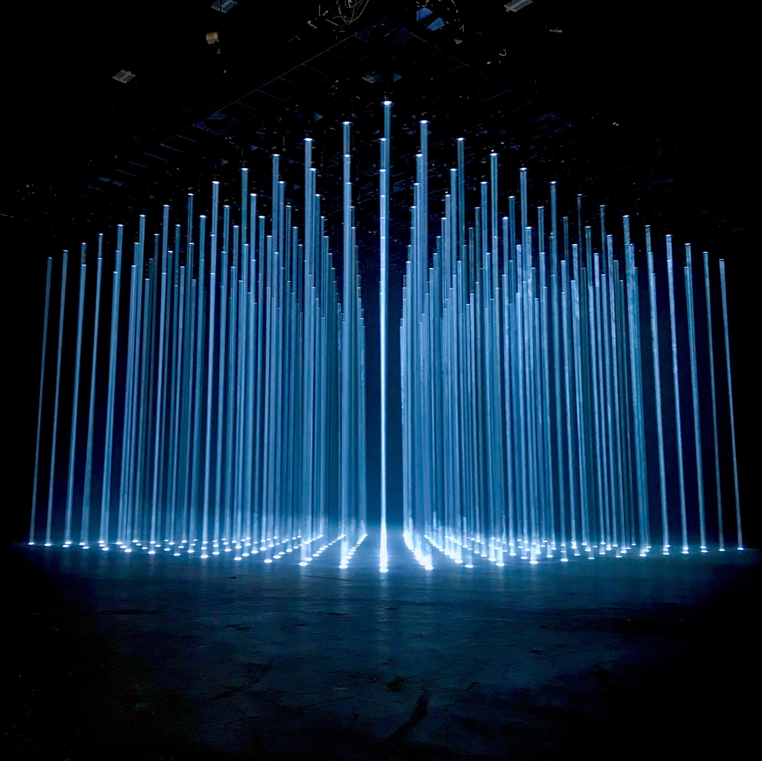
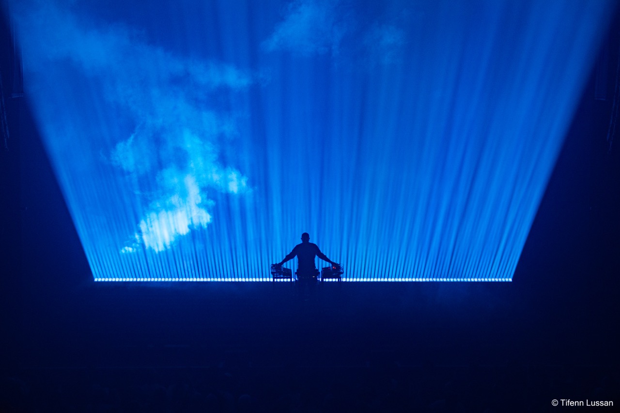
In your work for the recent tour by Etienne de Crécy, you created very captivating looks using only floor lights, with no overhead or side lights. What was the advantage of that?
“The direction to use only floor lights was a deliberate choice to create an extremely sober and stripped-down stage, while still having a large number of light beams that could play on the width and depth of the stage space. By using a single type of machine and placing everything on the floor, I was able to create a very consistent and visual aesthetic, which highlighted the music of Etienne de Crecy. Having all the projectors on the floor also allowed us to create very dynamic and immersive lighting effects, playing with angles and perspectives to create a sense of depth and volume.”
You also made brilliant use of dark space on that tour. What are your feelings about using, but not over-using darkness and shadows? What do they contribute to a design?
“The use of dark space is really a key element in my design work. I think that darkness and shadows can be extremely powerful tools for creating atmosphere and tension on stage. When used judiciously, they can add depth and complexity to the show, while highlighting key moments of the music. Darkness can also be used to create a sense of anticipation or suspense, by making the audience wait for what’s going to happen next. And when used in combination with moments of intense light, it can create a dramatic contrast that adds to the emotional impact of the show.”
You also had some memorable moments with monochromatic color looks in that tour. How would you define the role of monochromatic palettes in design?
“Monochromatic palettes are really a powerful tool in design. For me, they allow us to create a visual coherence and aesthetic unity that can reinforce the emotional impact of a performance. By using different shades of a single color, we can create a rich and varied palette while maintaining overall coherence. Monochromatic palettes can also help focus the audience’s attention on key elements of the performance, by creating a subtle but effective contrast between different shades of color. This can be particularly useful for highlighting the movements or actions of the artists on stage.”
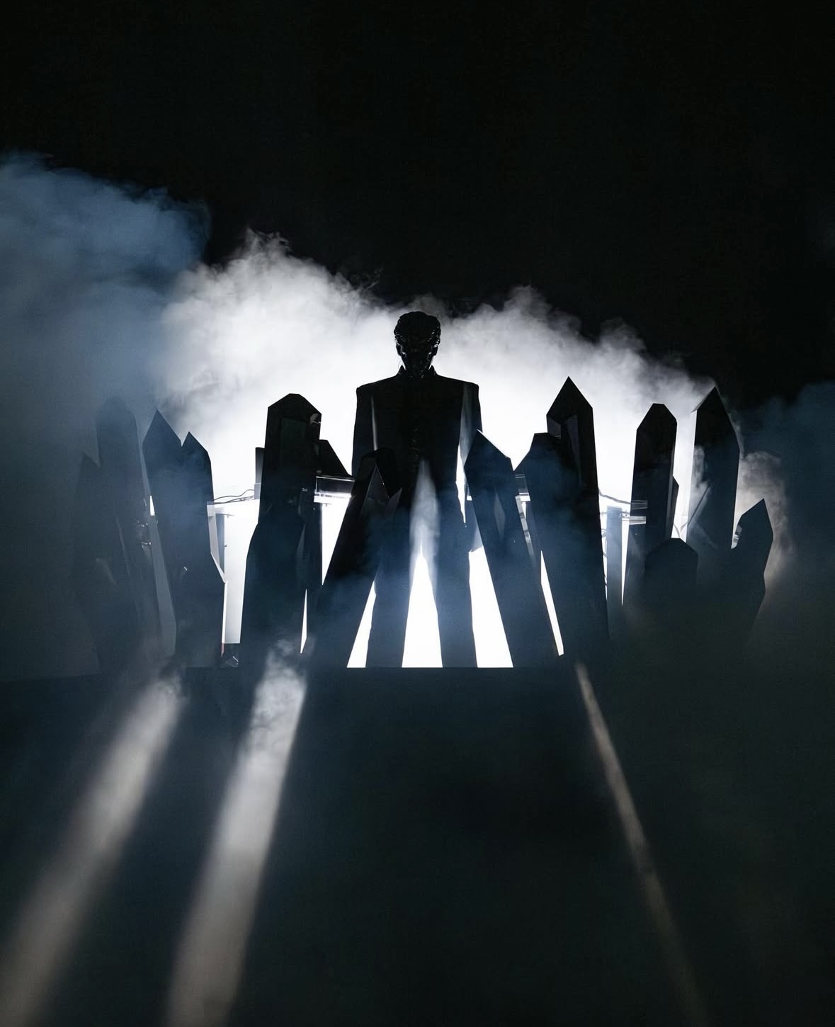
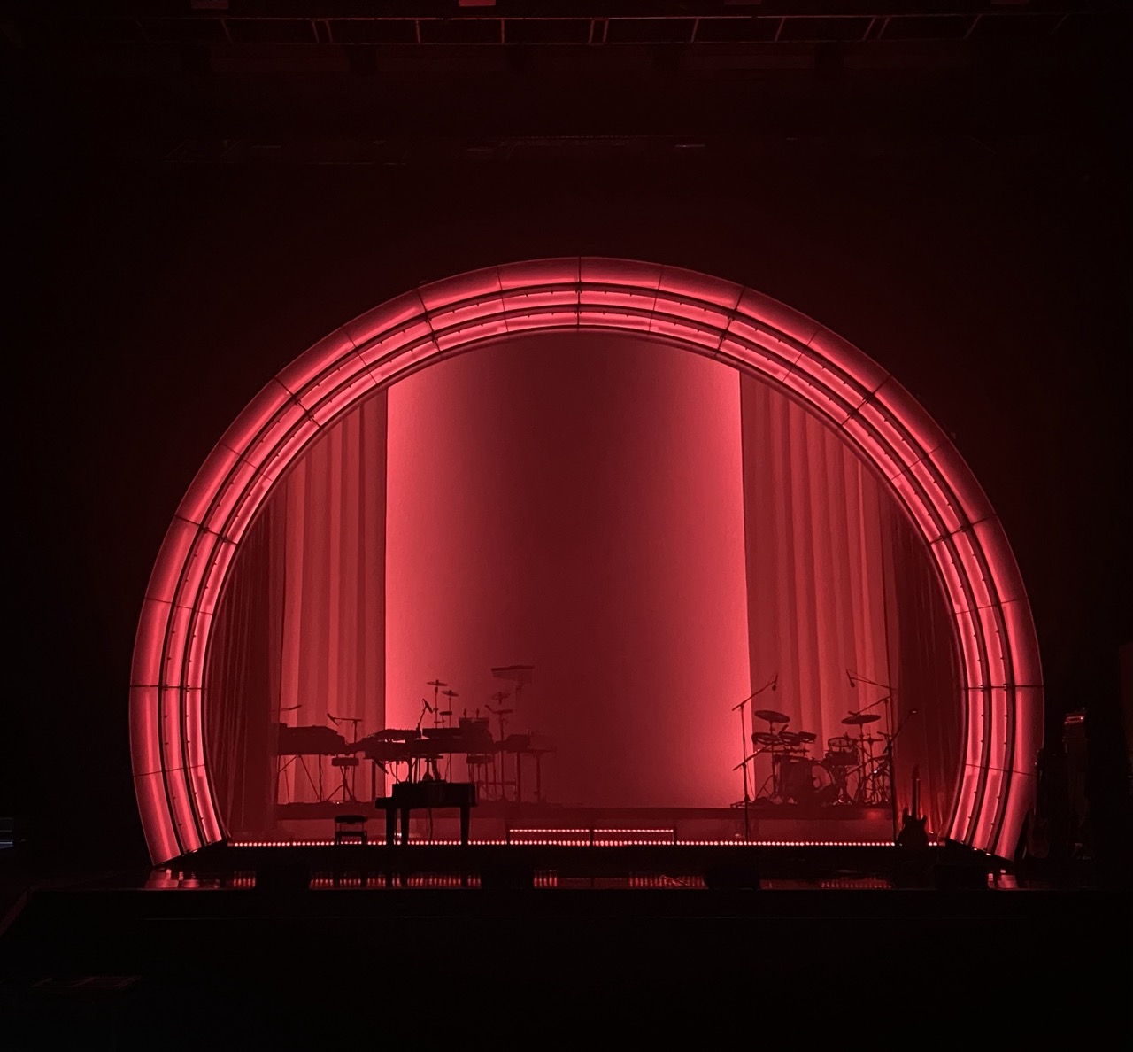
Earlier we mentioned Gesaffelstein’s Requiem Tour. You had a memorable black monolith scenic piece in that. Can you tell us a bit about your vision there?
“The black monolith on Gesaffelstein’s Requiem Tour was a key element of the scenic design. We used Vantablack paint to achieve an extremely absorptive black surface, creating a sense of depth and volume. The idea was to create a monumental and intimate stage space, with the black monolith as the central element. This project was the result of a close collaboration between Gesaffelstein and myself, to create a visual and musical vision that reflected the essence of his music. The black monolith was a key element of this vision.”
You pay very close attention to sets in general. How would you describe the relationship between scenic elements and lighting. Do you select the scenic piece first, and then figure out how to best light it? Or do you look for the scenic piece that best fits your lighting design?
“Before, I was mainly focused on lighting, but now I’m fascinated by set design. For me, the set is the key element that defines the aesthetic and atmosphere of the stage. Lighting serves to highlight the set, to reveal it. I often select the set first, and then design the lighting to highlight it in the best way possible.”
Do you have a favorite color to work with?
“White! I think that white is a very versatile color that can be used to create very different atmospheres depending on how it’s lit. White can be warm and welcoming or cold and minimalist.”
Is there a color that you find most challenging to work with?
“White… ha-ha! Playing with light intensity on white can be a challenge, as it’s easy to create too much contrast or over-lit areas. But when done with care, white can be a blank canvas for telling incredible visual stories.”
How do you get inspired at the start of a project?
“I get inspired by the music, the artists, and the universe of the project. I often start by listening to the music on repeat, to immerse myself in the atmosphere and style I want to create. I also look at visual references, films, photos, artworks that could inspire me. I do research on the themes and ideas related to the project, to better understand what the artists want to express. And then, I start making sketches, diagrams, experiments to see how the ideas take shape.”
Do you ever procrastinate at the start of a project?
“Yes, of course! Procrastination is a common phenomenon among creatives, and I’m no exception. Sometimes I feel overwhelmed by the possibilities and ideas, and I don’t know where to start. But generally, I find that the best way to overcome procrastination is to start working on the project, even if it’s just for a few minutes. This allows me to get into the zone and start generating ideas. I also think that procrastination can be a sign that I’m not quite ready to start yet, and that I need to take some time to reflect and prepare before diving in.”
We know you are committed to minimalism, but there are some musical genres like EDM that don’t lend themselves to this approach. Are there any lessons that designers working in those genres can learn from the “minimalism philosophy” to enhance their work?
“When we’re booked in EDM festivals after shows with impressive special effects, it can be challenging to follow them on a stage that looks like a giant butterfly (ha-ha). The audience has often been accustomed to intense visual spectacles and can be hard to impress. However, I think that’s exactly where the value of our shows lies: we propose an alternative, something more subtle. We strive to create a unique visual experience that complements the music and atmosphere of the festival. Some spectators may not appreciate our style immediately, but after watching the show for a while, they start to see the effort we put into proposing something different.”
What do you think you would have done if you didn’t become a lighting designer?
“If I hadn’t become a lighting designer, I would have continued in the field of industrial automation (working with electrical, pneumatic, hydraulic, and robotic systems.), which is what I studied. I’m a perfectionist and the idea that something works correctly satisfies me, but I was missing the creative side. This allowed me to apply my technical skills and ensure that systems operate efficiently and reliably. However, I felt a lack of creative freedom and opportunities to express my imagination.”
What is the thing you would like people to know about you as a lighting designer?
“I’m passionate about music above all. Nothing makes me happier than when the bands I work with tell me that I’m an integral part of their artistic career. For them, visual aesthetics are important, because apart from album covers and music videos, lighting, set