Color Talk – Roosevelt Dsouza’s Rainbow
Posted on July 1, 2025
With its sharp angles and distinct lines, Geometry shapes space. Color is less exact, though it too has the ability to define space and, perhaps more importantly, the moods that reside within that space’s parameters.
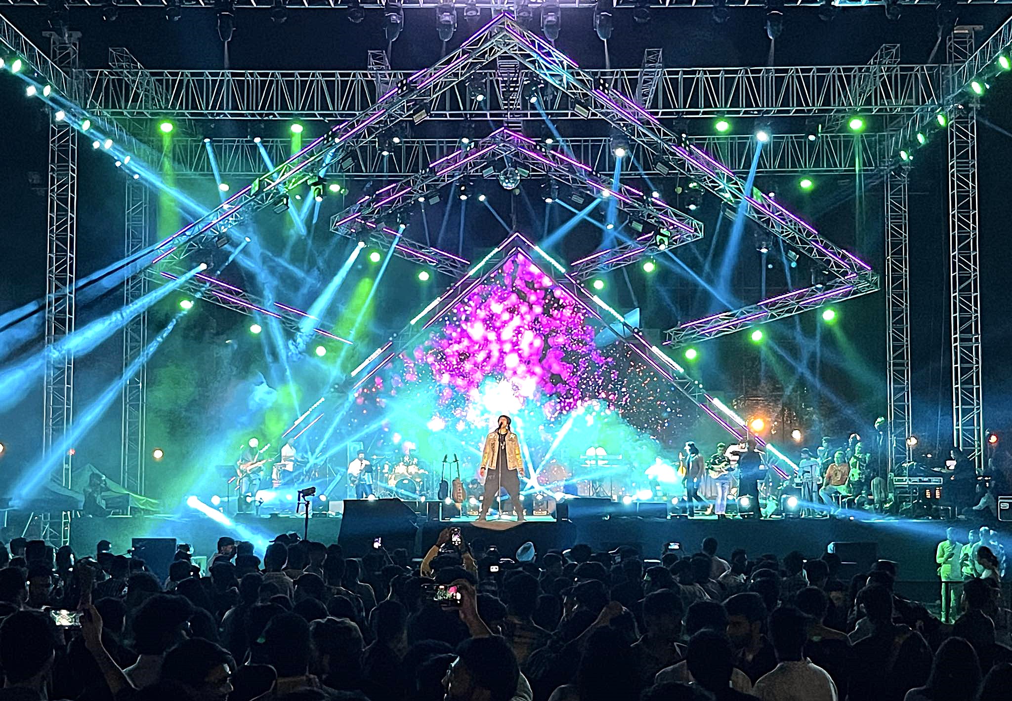
The power of both geometry and color were everywhere to be seen in Roosevelt Dsouza’s design for Indian playback star, Jubin Nautiyal’s recent global tour. We were struck how Dsouza used the “soft power” of color to change the emotional fabric of the space inside his geometric forms. Although that space was confined by the “hard power” of geometry, it seemed to have no limits in terms of the feelings it evoked.
There were many powerful scenes in Dsouza’s design, but the one captured in this photo held a special grip on our attention. Typical dominant colors like red and blue, both of which give rise to more easily defined emotional states, are not to be seen here. In their place are more subtle and abstract colors, perhaps to reflect the more complex feelings in some of the artist’s songs?
We were also struck by the number of colors that could be picked out in this photo. Ordinarily we might have found having this many colors on the stage at once confusing, but here they all worked together, flowing in harmony like well coached choir. Catching up with Dsouza, we asked to discuss this design.
You had quite a few colors in this scene. A lot of LDs are reluctant to have more than two colors at a time. Were you concerned about that?
“In many cases, I try and have a blend of colors in a few songs, instead of having all the songs in one or two colors. Every color conveys an emotion. For example red and magenta symbolize love, amber and yellow are a warm sun rise, blue and lavender are an evening party. Sometimes there are more emotions in a song, so you need more colors. As long as the meaning is true, the colors work.”
Did you regard any one color as the dominant color in your design?
“A few artistes recommended not using yellows, green or magenta, but if you visualize it properly you can manage in green. So green, it is! I can’t have red or blue because it needs to blend with the image.”
We really liked how you also combined geometric patterns with colors. The purple at the apex of the centerstage triangle looked especially beautiful. Why did you pick that color for that position?
“The colors I picked were from my mentors, Sam Keravala, Kaivan Mistry, and Ajit Shah. During fashion shows they used to have a two-tone for the opening few sequences and one color for the other sequences.”
What kind of purple (color number if you have it) was that purple?
“It is a mix of lavender and magenta.
The blue you used was also compelling. What shade of blue was that? How did you create it?
“The Blue I used was the Lee 132, 119, and my favorite 181 Congo blue.”
You broke up the colors very nicely with white. What color temperature was that white? “I try to keep the white to 50-perecnt, so the other colors come out.
What mood were you trying to convey with this color tapestry?
“I try to match the mood of the song and the lyrics. If it is a sad song I go with deep colors, such blue. If it is a happy song, I go with warm tones. Color always match an emotion.”