Color Talk – Kostantinos Dovas’s Magical Mix
Posted on September 2, 2025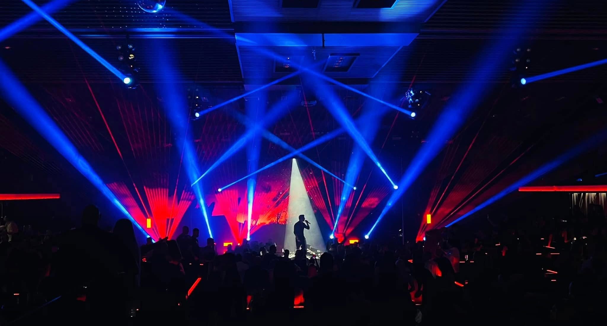
The transformative power of chemicals, comes not from the individual elements themselves, but from their interaction with one another. Combine hydrogen with oxygen and you get water. Put it together with nitrogen and out comes ammonia. Two very different results, indeed!
The same, as every designer knows, is true of colors. The drama of their interactions reverberates throughout a stage, animating it with anticipation, hope, fear, tension, anger and myriad other emotions. Greek lighting designer Kostantinos Dovas called forth this special alchemy in stunning fashion when he created multi-colored looks for a recent show by singer Petros lakovidis’s at the legendary VOG Club in the 2,800- year old cultural hub of Thessaloniki.
We were captivated by the imagery triggered by his magical mix of colors from the moment we saw this photo. Red, blue and white living side by side in a deep sea of black. Each occupying its own space, and each emanating from a different type of fixture, the colors spoke clearly in their own voices. They hardly ever even crossed paths! Yet, they seemed to be locked in passionate embrace. The power of their connection pulled us deeper and deeper into the scene, until we felt joined with the artist, who stood at center stage enveloped in white light.
To add an extra intriguing element of uncertainty to the scene, the designer sprinkled what looked splashes of yellow throughout the stage. In reality, though, it wasn’t yellow, but a red amber made to look like yellow by mixing it with green. Another example of the magic that happens when colors play with one another.
We know this column is about color, but we couldn’t help but be struck by how you used black to make all of your colors pop! Why did you use so much black in this design?
“Well, that is true. We, lighting designers often forget that if dark didn’t exist, there would be no light. The very reason lights and colors pop up is the dark environment in every show. Remember what the first thing is to happen before a show starts. The venue lights are cut off. If we understand that the darkness and the black environment are our base, then we will really value every beam, and every light and we will take our show to another level without having an army of lighting fixtures. A lighting designer is a painter who starts to paint in a black canvas.”
You used red, yellow, blue and white in this design. Did any of these colors respond to black differently than the others. Which color was it easiest to work against black? Which was hardest?
“The truth about black is that all colors correspond fine with it. The difference between the colors you mentioned is the mood each color provides. Red and blue for example correspond better on songs that are in a “lower tone” (for example, ballads). However, if we use red and blue together (red and blue, two “opposite” colors) we bring a contradiction to the stage and in the viewer’s eye that is impressive and beautiful. The most complex color for me is always red because is the less bright.”
Some designers are reluctant to use more than two colors. You added yellow to this beautiful design. Why did you do that? What role did yellow play?
“Yellow, in the image brought something extraterrestrial. If we want to be accurate, it isn’t truly yellow, as it seems, but a red leaning to amber that intentionally looks like yellow. That is the reason why it mixes so well with the rest of the design (red and blue). As I was planning this scene, with blue and red contradicting each other, I realized that sticking to these colors would be good but not great. The ‘yellow’ color did its job and brought something different than the two moody colors could by themselves bring.”
Why did you spotlight the silhouetted artist in white rather than a color?
“In my lighting designs I always keep something in mind that others may find disturbing. The lights are truly the part that can take your show to a whole another level or bring it down, but they are not the center of the show. The center of the show is and must be the singer. The artist in this image (and most times in the show) is silhouetted with a white spot, that makes him pop out from the basic image. In my opinion, if the crowd is focused more on the lights than the singer himself, the lighting designer has not done a great job, but a bad one.”
Why did you use red in the background and blue for the aerials, rather than the other way around?
“As I mentioned before, red is the hardest color to use because it is the less bright. So, I wanted to create a shocking image in which the beam lights would rip apart the whole venue. This couldn’t be done as great if I used red color on the beams. Moreover, I wanted to create a warm atmosphere in the background. The red color wouldn’t be as deep as blue.”
Can you tell us which color codes you used ?
“I mixed the colors myself; I didn’t use the color picker. It wasn’t so sophisticated anyway.
The red color is 100-percent red, which we used on the lasers. The blue 100-percent blue- that was used in the beams. And the red to amber color is 100-perecent red and 25-percent green.
Looking at this photo, which color would you say was most critical to your design? And why?
“We cannot deny that the blue color is that defined the volume of this scene. But, for me, the most critical color was red, without a doubt. Red on the lasers brought a deep mood on the stage and behind the singer playing with the shadows. Finally, Red to amber color on the strobes mixed so good with the color of the lasers. Moody red on the lasers and bright red on the strobes met and together created a beautiful image, different from the “everyday” shows image.”