In many ways, Finnish trio Apocalyptica draws power from defying expectations. After all, classically trained celloists who perform metal music with the pugnacious ferocity of a hardcore band aren’t going to follow convention!
Well… neither did their acclaimed designer Mikki Kunttu, when he created the production for their recent EU tour. Fearlessly tearing up the rule book from the moment he began working on the design for this tour back in 2023, Kunttu forged his own creative path.
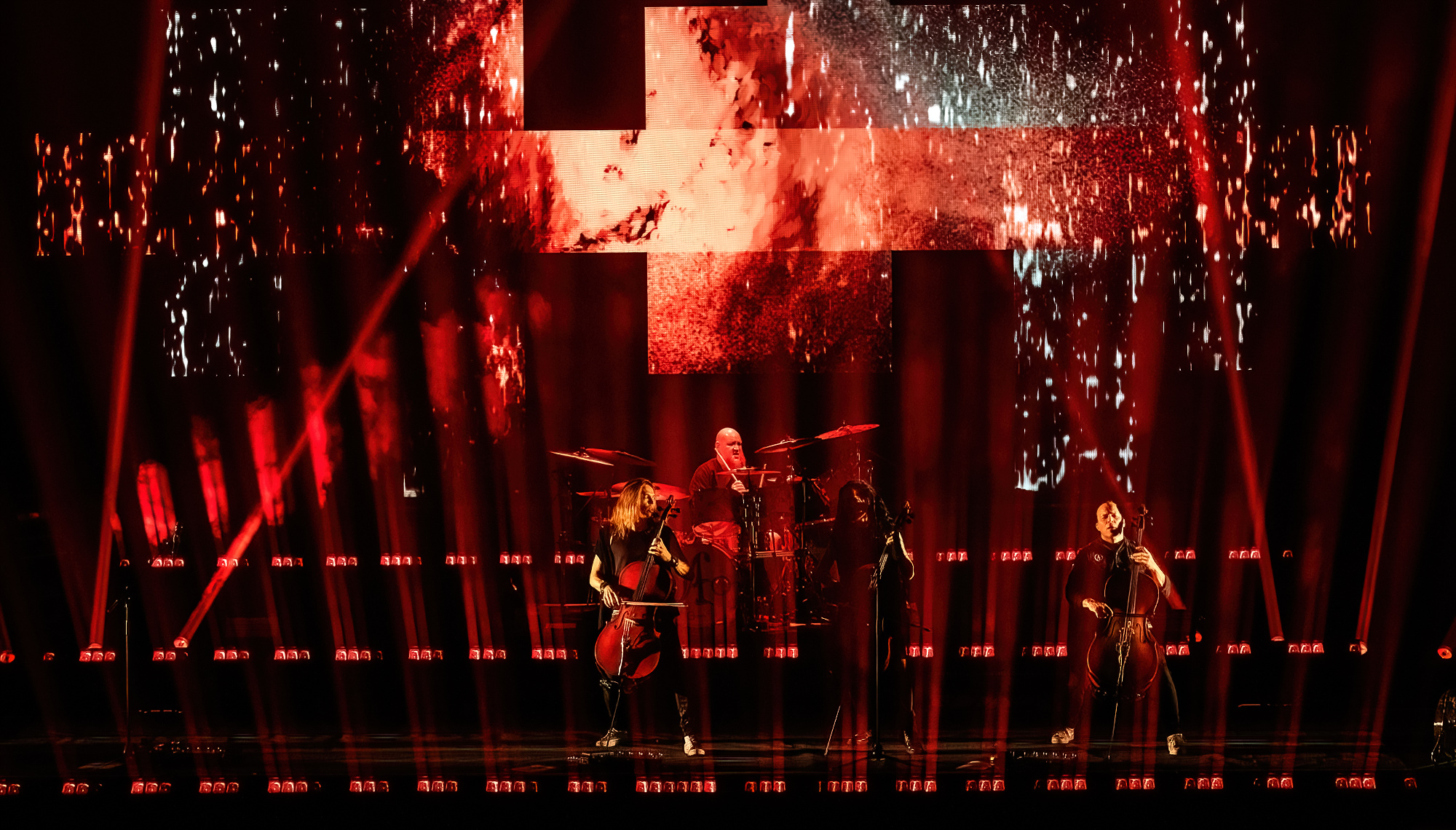
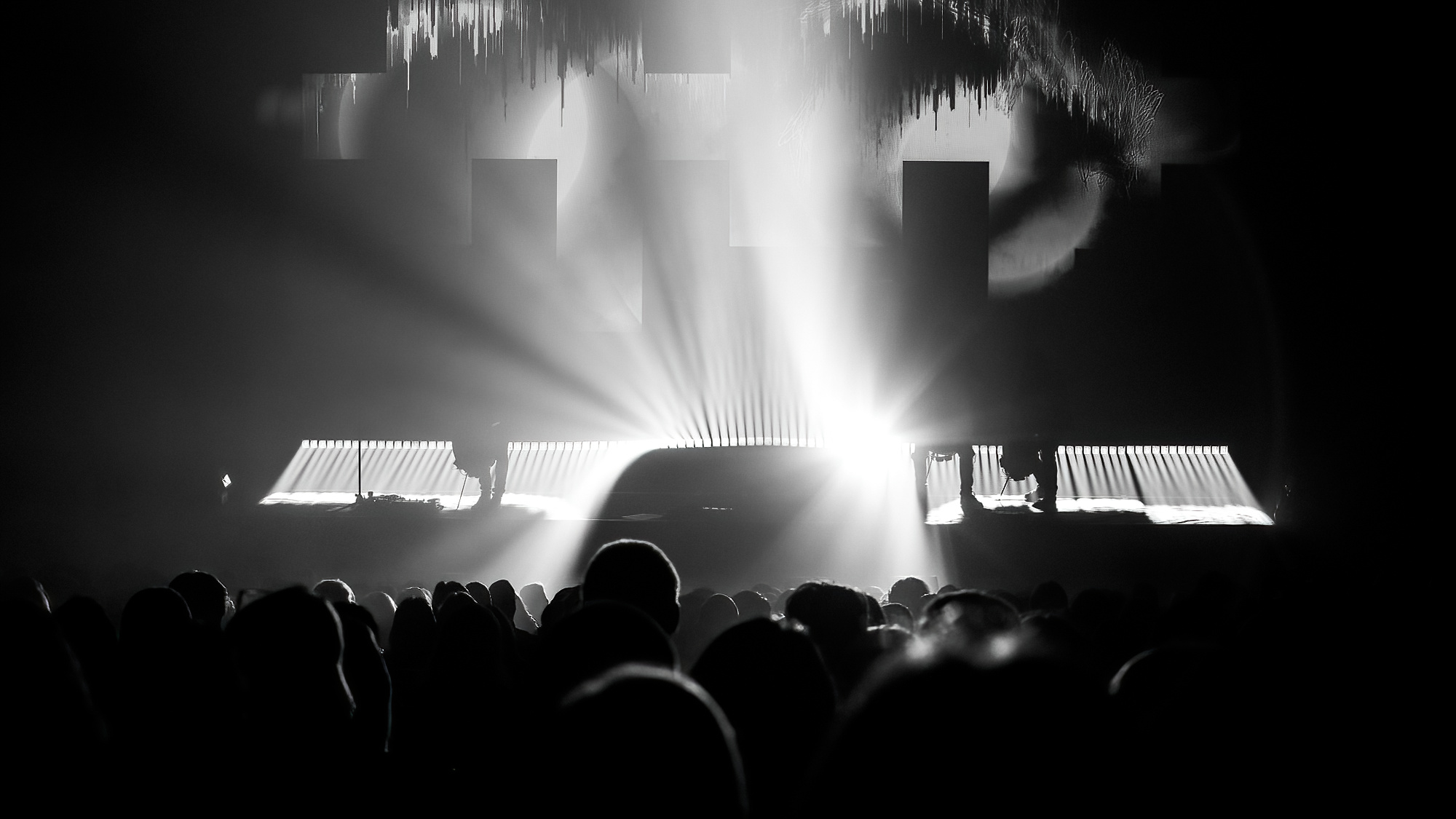
Conventional wisdom might have suggested that he stick with a predictable, symmetrical design, but he had other ideas. Wishing to give the stage a gripping, edgy and sometimes menacing aura, he incorporated sharp fragmented uneven asymmetrical looks into his show.
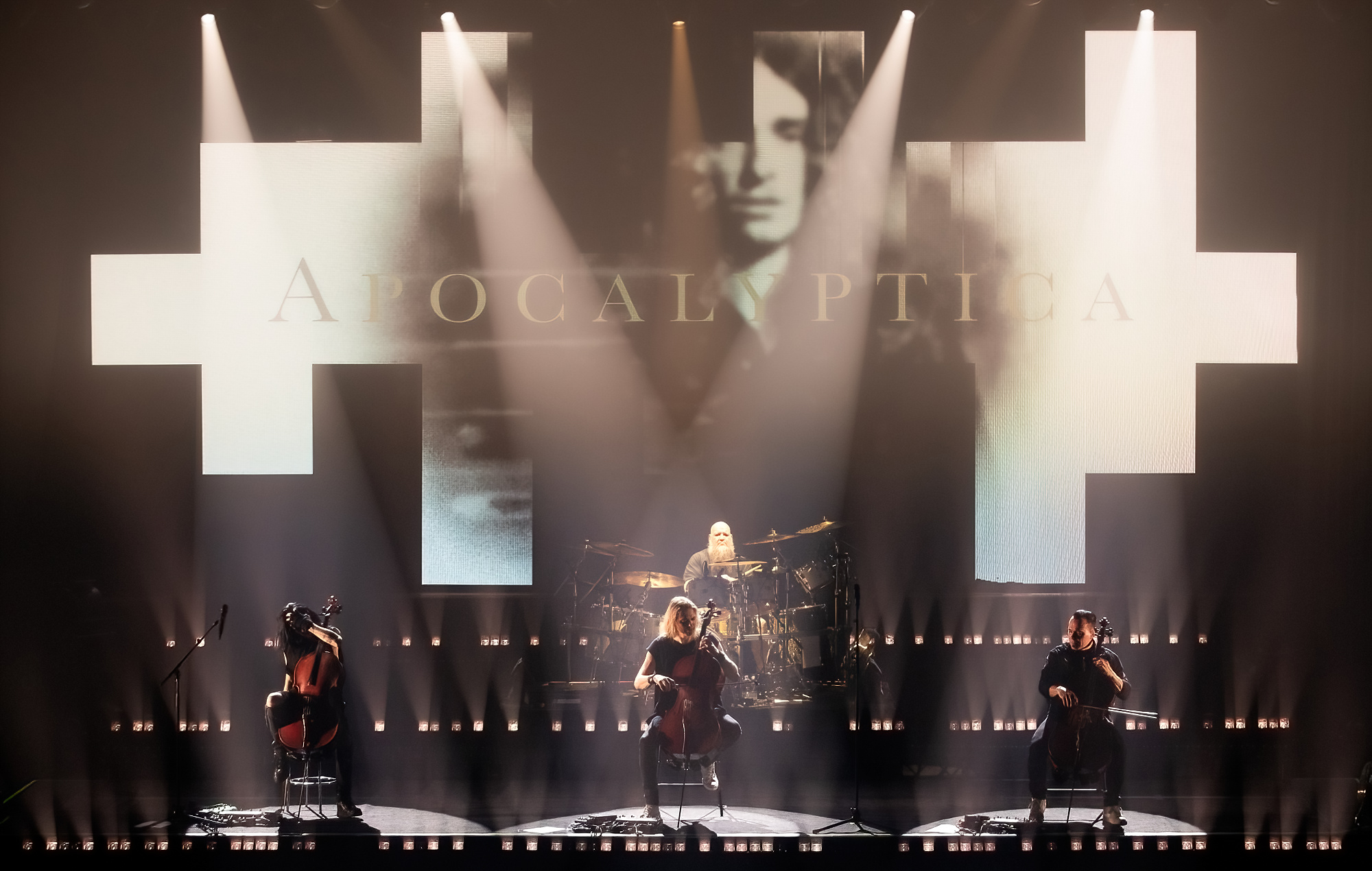
Endowing the stage with another out-of-the-ordinary flourish, Kunttu minimized horizontal space and created distinctive linear looks by relying primarily on one fixture, the COLORado PXL Curve motorized batten that he coordinated with a “fragmented” video backdrop.
As for colors, well there were some — but for most of the show, the stage glowed with intensely bright white light from these battens. The sheer boldness of this light, along with the stage’s sharp geometry, evoked a harsh, metallic industrial mood — hardly the setting one would expect to support a cello performance!
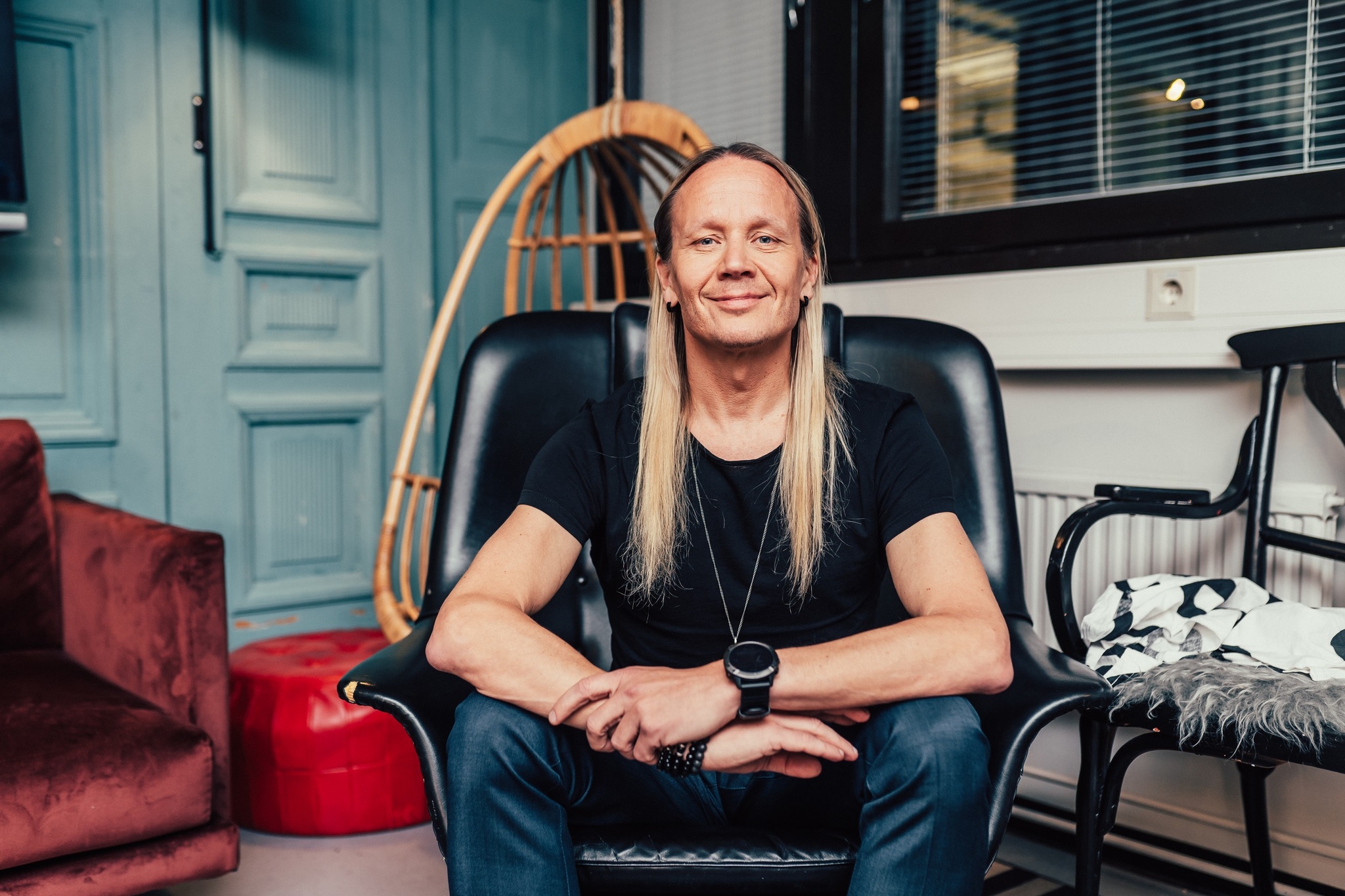
Kunttu talked to us about the evolutionary history of this unique design. And, as creatives often do, he also mused about some changes he would make to his work if he could do it all over again. But honestly, as anyone who saw his design would attest, he came pretty darn close to perfection this time around.
You’ve said you began working on this rig in 2023, but your involvement with Apocalyptica goes back way further. So, in a sense this rig’s origins extend beyond that date. Can you tell us about your history with the band?
“I have worked with Apocalyptica on a few occasions, and I guess the first production was back in 2006-2007. I really like the guys and it has always been a pleasure to work and hang out with them. In 2016, the band re-released their original Plays Metallica by Four Cellos album, which was originally released in 1996, and I came back to design that tour. I think the visual design for that 2016 tour is really one where things really fell nicely into place as far as my design vision for Apocalyptica. The first half of the concert was more a theatrical, classical concert setting that was super simple and had no rock aesthetic at all really. I loved that simplicity and the way it brought out the poetic contrast and connection between this beautiful classical instrument and Metallica’s epic songs.”
So, how did this vision come to fruition in this tour?
“The visual aim in the tour design was to offer a lot more fragmented and even noisy style. I still wanted to stay rather minimal and theatrical in terms of movements and the use of color. A lot of focus was also put on the programming in terms of accenting, rhythm and contrast. I invited LD Pekka Martti on to the Apocalyptica project back in 2007, and I’ve always said that has been the best design choice I have ever made for a band. I think Pekka and Apocalyptica have been a perfect match. He is the best programmer/operator I have ever met when it comes to busking or timecoded busking type of lighting.
“Pekka has also done the whole design for some of the tours the band has made over the years. In some respects, this new tour was sort of the old gang getting back together. Which is very nice. I started the process by going through that history that we have together and sort of evaluating what was good and what not. What worked and why – and if not, why not. I also looked closely at the project from a production point of view to evaluate what was possible and what was not. It was really a hunt for the essentials, not anything more complex than that.”
In our view, much of the power of Pekka’s work on the console and your design in general is generated by the rig’s beautiful simplicity. Can you tell us a bit about that?
“You do not want to tour any lights, structures, crew or equipment that does not 100-percent need to be there. Apocalyptica is not an arena size production, but rather a concert hall / large theater scale adventure. The venues vary in size and shape and so that made scalability an important factor as well.
“I basically wanted to create a design where scalability would be the core idea. Therefore, the first big decision was to limit the overhead rig to a minimum. I wanted 90% of the production to be built as self-standing ground support instead. Frankly, in the end we could have done a little better job with the technical design in pre-production and achieved a lot more efficiency in terms of how the rig’s modularity works and all the logistics attached to it. But of course, I’m happy with the looks we have on the show, I just honestly think life on the road could be more efficient and maybe easier if the technical pre-production would have been more detailed and perhaps supportive in terms the creative intent.”
What were the biggest challenges in making this rig happen?
“I was very flexible on a lot of things, but not on the account of the curved battens that made up the core of the rig. That part of the rig was non-negotiable. In practicality this limited the options we had looking for the rental shops for this tour. Otherwise, there’s always the aim to stay within the budget and that naturally causes acrobatic balancing between this and that. But it is all for the best of the show, as we all need to find priorities and lock on to them.
“I think I would still really love this design to evolve to more asymmetrical and broken direction. That’s I guess how it is with designers – one always sees elements that can still evolve and dive deeper. Somehow, I feel symmetry is so embedded in the way we see the stage that making something asymmetrical feels like you’re fighting the system! In terms of challenges, it kind of cuts both ways. I have a number of linear RGB white strobes behind the fragmented LED screen and they really aim to work together with the screen content. Most of the show the screen content is very simple and the lines of the linear strobes sort of complete the looks.
“However, as the one of the main ideas of the design is modularity, the strobes are usually the ones that get left out in case time and space is too limited. So, you know, the design concept allows this modularity where you can alter the size and shape of the screen, the number of fixtures used, basically the layout of the show- but at the same time it can also be its own worst enemy. The modularity allows the tour crew to improvise a little more from day to day.”
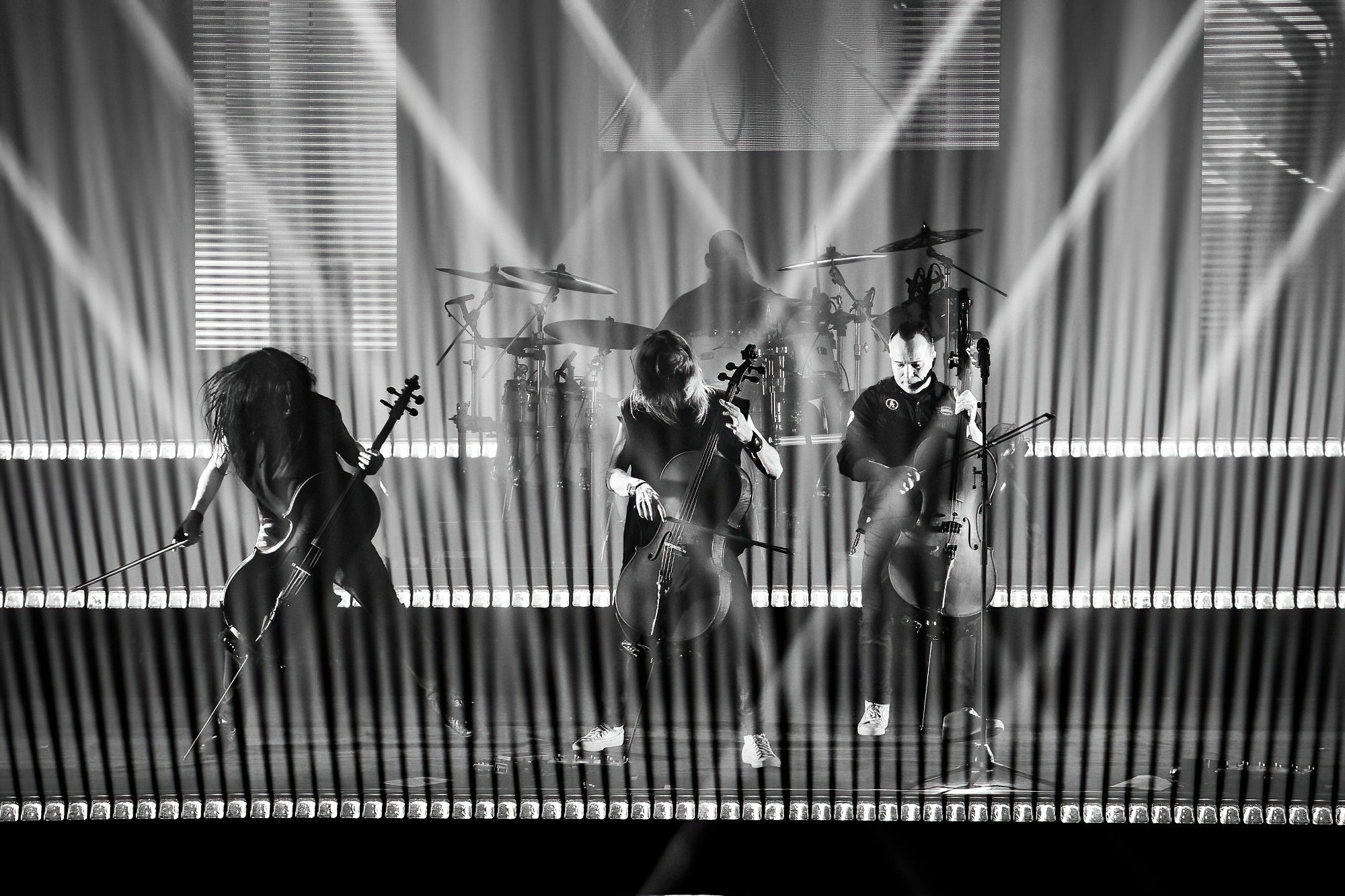
You arranged the three identical rows of nine motorized battens elevated in steps, beginning with 30cm one the second row, then 60cm on the third. What did this configuration do for your show?
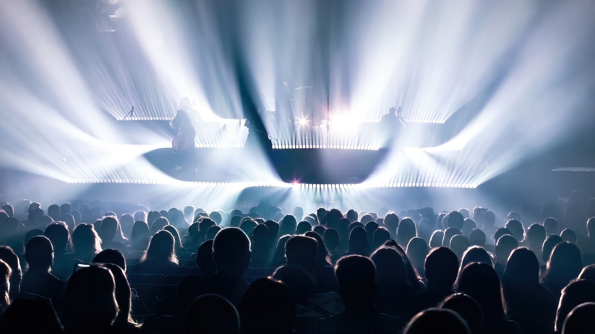
“The curve layout of the battens on the deck is the signature visual for this show. It works in a number of ways. In practical terms it is an easy element to deliver in every venue as they do not require any rigging. They simply roll out of the truck and then it is simply plug and pray!”
Why did you decide on three rows, instead of four? Nine battens instead of 10? Did you experiment with different configurations?
“Well, three rows relates to the number of performers we have on stage and the way they are set up on stage. As I said before, sometimes flexibility might mean a show is done with only 2 rows. The count of nine in a row is optimal for the size of the cello riser on stage.”
You had beautiful stark white looks throughout much of the show. What color temperature did you run the lights at?
“Oh my. There is a lot of open white and different shades of white. I would guess we drift between 2500 and 9000 K!”
This design was so evocative. Did you experiment with different ideas when creating it? Were there ideas that you thought about and then decided not to use?
“I had a couple of versions before and after this one that were also aiming for this kind of a direction. The core of the design are the curved battens in three layers and everything else needed to complement that. As far as the LED screen layout is concerned, I wanted to have a broken, fragmented surface that is more a set piece than a screen at times. Oftentimes I do not approach screens as “video,” but more as if it is a sort of an organic element of light energy. I often find animated content pretty disturbing actually and tend to have a lot of stills that are there to serve the overall visual.”
The battens anchored your design, but can you tells also about which other fixture types you used and how you positioned them?
“There are a couple of front lights for the band, small wash movers as sidelights, a simple rig of backlights and a few floor specials for beams, as well as a couple of strobes for a little added bling-bling.”
As a designer, what did you learn from this project?
“That is a great question! As far as programming, this was the first one where recipes were used throughout everything and throughout the show. So that at least was a new thing and seems to serve the touring pretty efficiently. I learned once again that I love live music and the excitement of a live concert. The audience completes the production and reveals the achievement in good and in bad. I love that in the world we live in these days, rock and roll is one of the only things that still makes sense. And there is no better way for people to come together. Long live Rock and Roll!”


