Photo: Todd Moffses
At its best, art holds a mirror up to its times. Not one of the fun-house variety that distorts to flatter myths or scare up false demons, but a relentlessly realistic one that reflects things as they are, and through the artist’s perspective offers hope for how things might somehow become better.
Such was the artistic mission that powered Muse’s 2022 “Will of the People” LP, which took an unsparing look at a looming post-apocalyptic world though its words and music. The same compelling force can be felt throughout arenas today on the multi- Grammy winners current tour in support of the LP, not just in the British rocker’s shredding riffs and mind-bending electronics, but also in a powerful production design that is generating so much attention in the press.
A collaboration between Creative Director and Co-Production Designer Jesse Lee Stout and Lighting Designer and Co-Production Designer Sooner Routhier, the thought provoking visual panorama does more than merely support the music on stage. It also creates an all-embracive environment that works with the band’s performance to burnish itself into the audience’s collective consciousness.
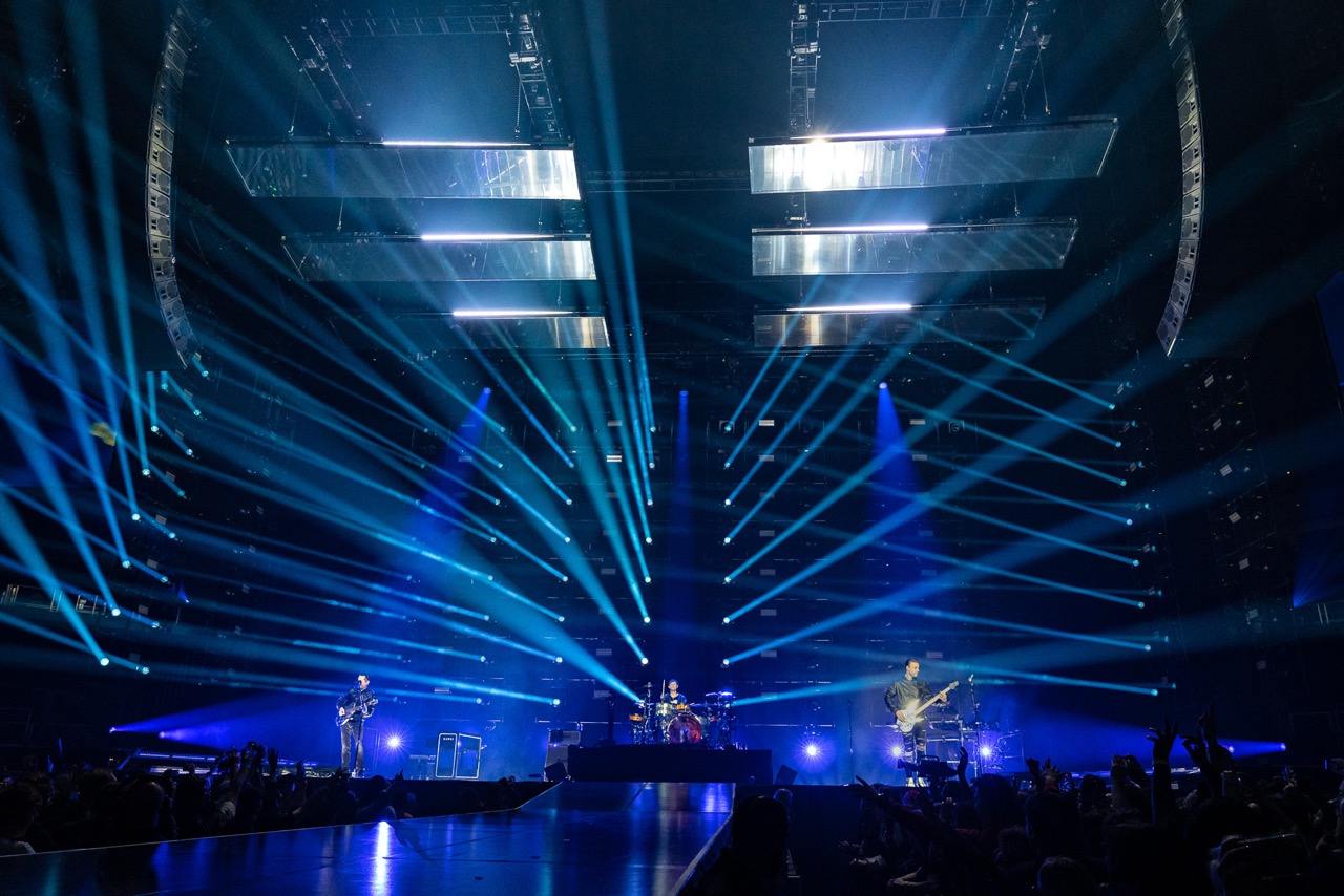
Photo: Todd Moffses
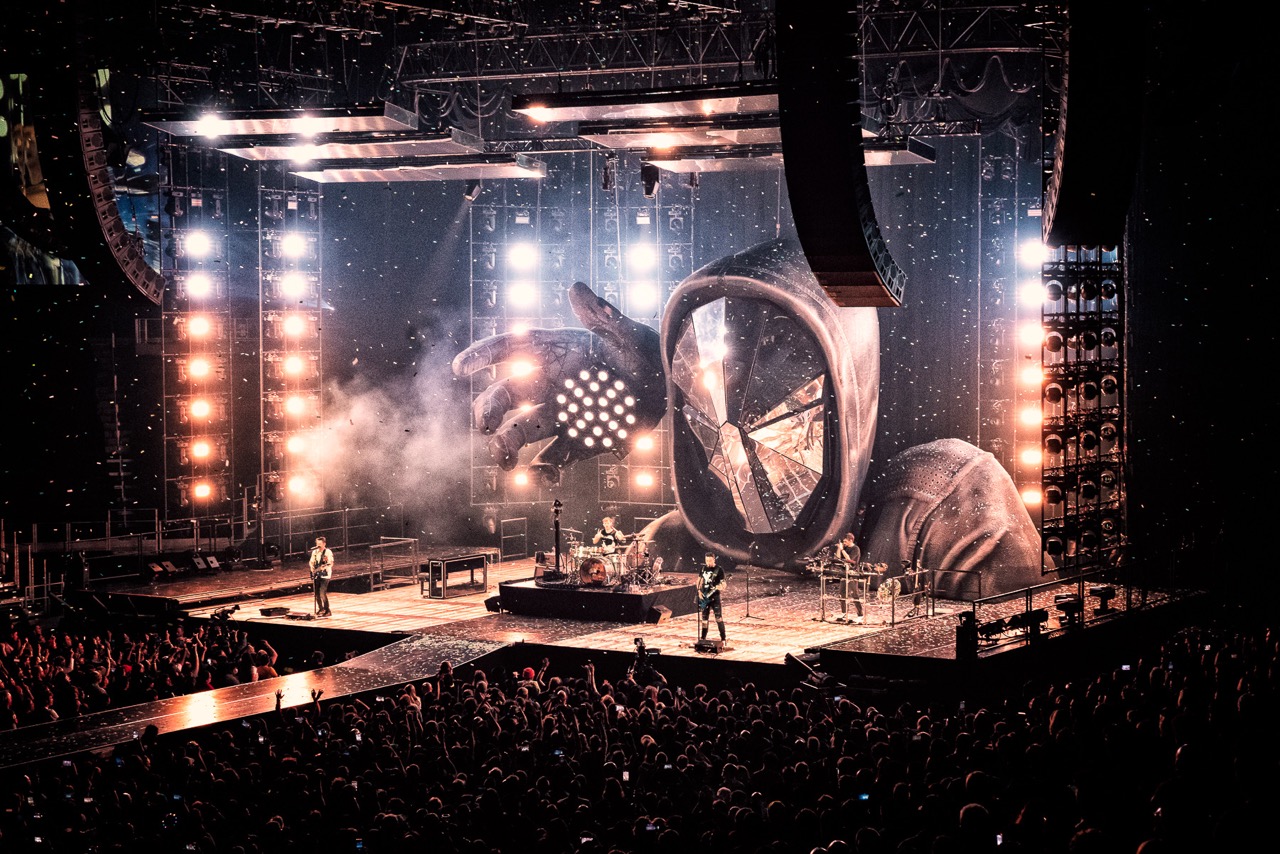
Discussing the design, Stout noted: “The band and I wanted to strip down some of the theatrics from the prior tour, although we didn’t abandon them completely. We worked with the band to develop a post-apocalyptic near-future world as a metaphor for our ‘New Normal’ in today’s society. In the past couple years, a pandemic wreaked havoc, an insurrection stormed the capital, anonymous activist hackers attacked governments, and corporations, and people began tearing down monuments across the globe. We all quickly grew accustomed to wearing masks, so we proposed a story of an extreme group of vigilantes resetting the world to ground zero. With this in mind, we really wanted a lot of exposed tech in our design to evoke a bit of that futuristic dystopian vibe, but we also wanted to balance it with some sleek elements (the perspex stage, mirrors everywhere) to also lean a little sci-fi, as the band’s brand always does.”
Routhier described how this concept was translated into a production design. “After pouring through the creative direction for the new album cycle, we worked together to create a rig that feels like the skeletal nature of a post apocalyptic, near-future world,” she said. “The rig consists of grids of lights that put the band inside a deconstructed building; simplistic, industrial, and homogeneous. This became the visual identity of the underplay tour we did in the fall of 2022, and it has been carried through into the arena tour in 2023.”
Key to helping the team achieve this vision were 122 of our Color STRIKE M fixtures, which, like the rest of the rig was supplied by Upstaging. The vast majority of these motorized strobes are positioned in a horseshoe configuration around the stage, while 32 units are located under the plexiglass stage, with a few others placed on a truss in the house for audience lighting.
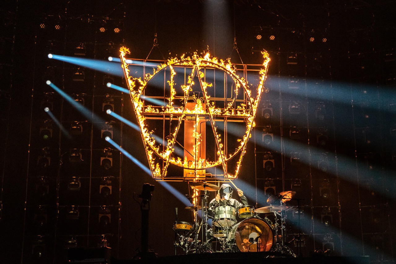
Photo: Todd Moffses
“The STRIKE Ms in the horseshoe configuration around the stage help us create the wall of light around the band,” said Routhier. “They are one the main workhorses of the show. The units in the upstage row under the stage are usually used to uplight the inflatable characters throughout the show. Otherwise, all the under stage lighting makes the plexiglass stage feel like its own lighting instrument.
“We’re getting some excellent colors out of our STRIKE Ms,” she continued. “There’s one particular crazy color effect we do with them for the song ‘Won’t Stand Down,’ that I’ve never been able to get out of any other light before. We mimic it in the rest of the rig. It almost feels like a digital color glitch.”
Run by Associate Lighting Designer and Programmer Aaron Luke, and Programmer Joe Lott, the lightshow flows smoothly with the band throughout their 24-song set (including two encore numbers), accenting key moments with some intense strobing.
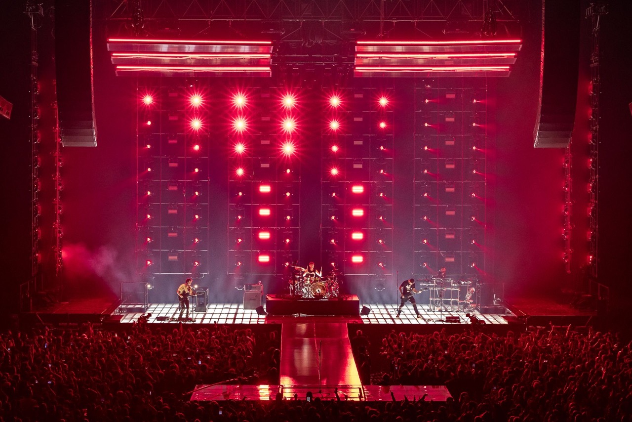
Photo: Todd Moffses
“This set list contains heavier music than the previous tour and that lends itself to lots of strobing,” said Routhier. “The challenge we always face when the music requires lots of strobing, is that it can become too much, leaving the audience blinded by lighting. It’s not always about the lights! HAHA! So, we try our hardest to vary the types of cues in the strobes. We use all of the strobes in the brightest strobe possible, in white only a couple times in the show. This keeps those super bright moments more impactful.”
“I think the team really tried to let the music guide the approach by following the dynamics,” added Luke. “Musically, some hits are very loud and in-your-face, so we try to let those be the biggest moments. Then there are those times when something is happening in the music that needs to be accentuated, but maybe it’s something relatively subdued or minor to the overall feel. These moments we find it more appropriate to use fewer fixtures or even a smaller number of pixels within the fixtures.”
Movement, shape and color also flowed through a continuous spectrum of change throughout the show adding essential variety to the design, while also ensuring that it kept pace with ever nuanced change in the music. “I wanted beams of light to extend beyond the stage to help further the idea of the skeletal building structure,” said Routhier. “Also, we need diversity in cuing with the vast set list. The different directional movements help us paint each song differently.”
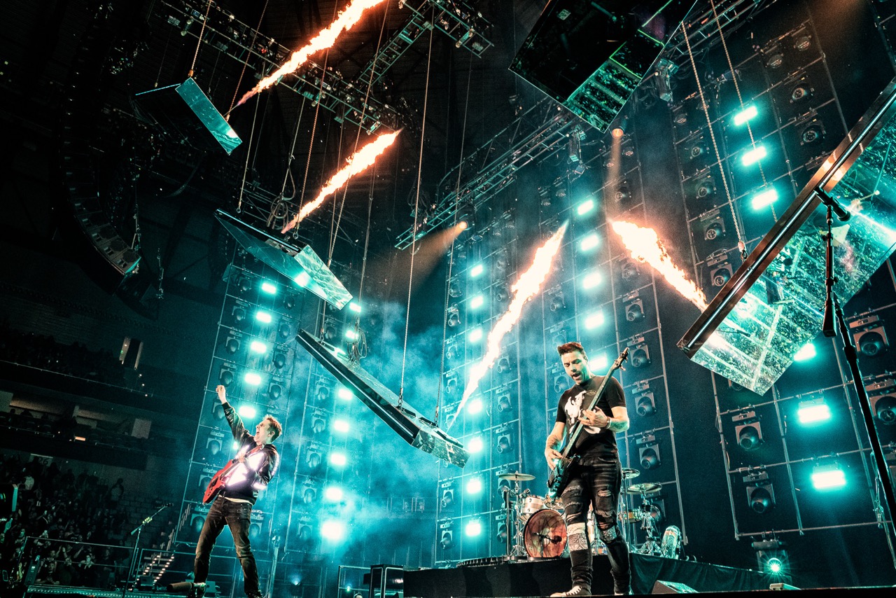
Photo: Todd Moffses
Varying geometric configurations also creates myriad looks that reflect different dimensions of the music. For example, for “Plug in Baby,” the design team created a floating diamond shape with the mirrors above the stage. The lighting running in a waterfall pattern along the inner sides of the diamond results in a trippy movement that is a bit disorientating, creating a worm hole or warp zone effect above the band.
In terms of color, Stout said he was looking to create a stark difference from the band’s last tour (Simulation Theory), which leaned heavily on the aesthetics from the SynthWave subculture, including neons, cyans and magentas. Instead, he wanted to go with a palette that was more post apocalyptic.
“With this campaign we created a polluted, dirty, dusty world, and our color choices pulled from that,” he explained. “The main color combo throughout the show is orange and teal, very ‘Mad Max Fury Road.’ Even though songs like Starlight and a few others might have pink or purple, they are very desaturated and set alongside sandy golds.”
Photo: Todd Moffses
Color also coordinates beautifully with video content in the show, creating what is one of Stout’s favorite looks. “I love the way the video content turned out and really drives the narrative of the show and introduces characters before you see them as 30-foot plus high sculptures,” ‘he said. “There are also some great guitar chase looks Sooner does with the STRIKE Ms in Madness.’”
For her part Routhier said “There are so many great moments in this show direction that Jesse and the band created. It’s hard to pick just a few! Every time a new scenic element is introduced, the excitement of the show increases.”
Quite a few critics would agree with her. As one New York scribe wrote, “I don’t think I will ever forget Muse’s show at Madison Square Garden on Friday night, as it has been seared into my retinas… I can still see it when I close my eyes.”
Such is the power of art that reflects its times.
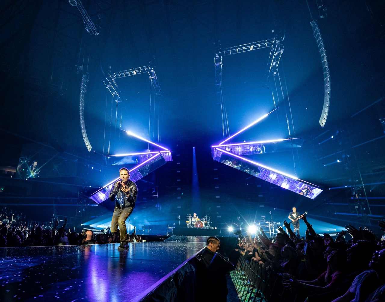
Photo: Todd Moffses


